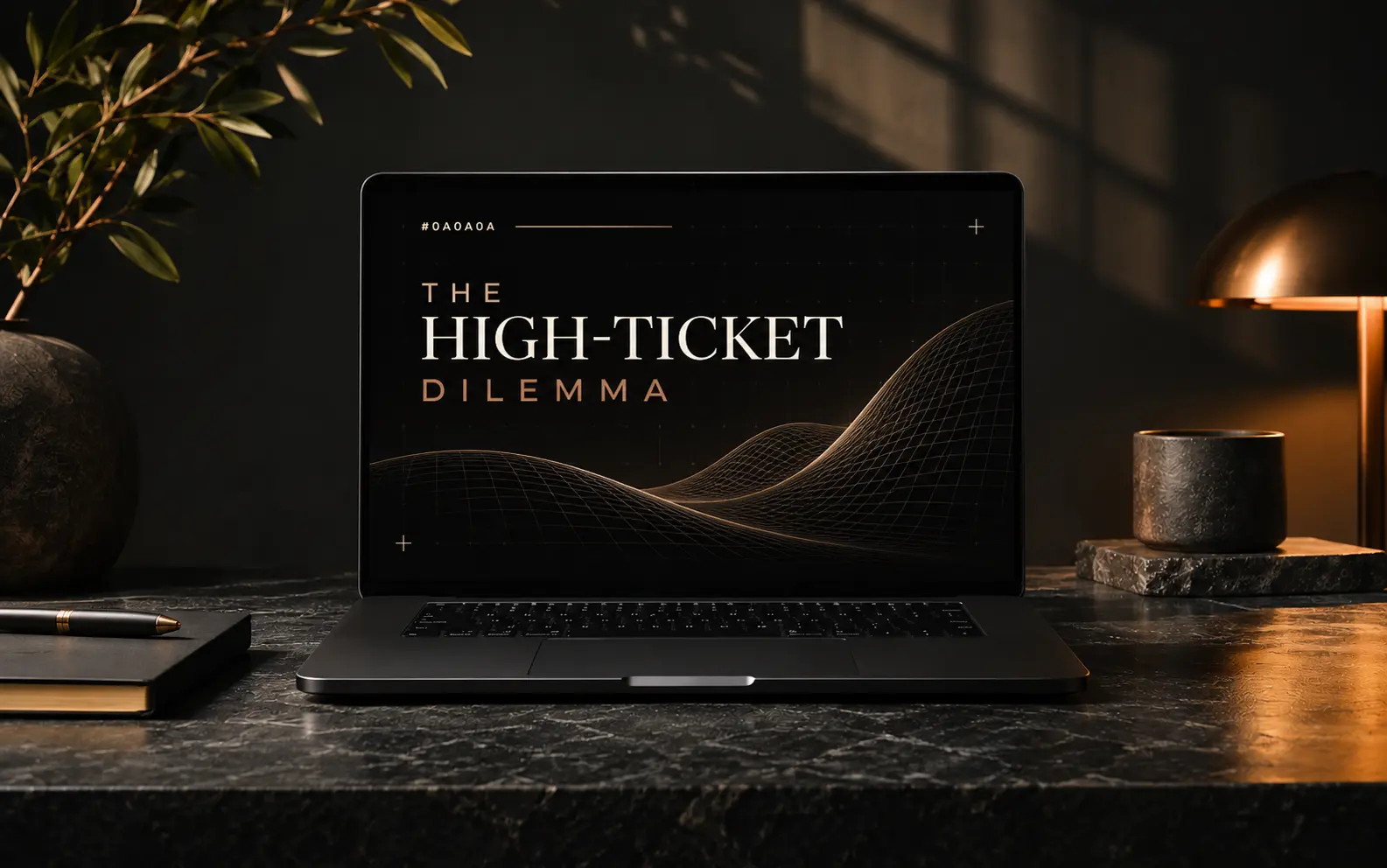
The High Ticket Dilemma: Why Most Boutique Websites Fail to Convert


Beautiful isn't the same as persuasive. High-ticket buyers need proof, clarity and a low-risk next step. Most boutique sites give them only atmosphere.
- High-ticket buyers judge risk, not beauty. Your site must lower perceived risk in the first scroll.
- Specific proof (numbers, names, process) beats adjectives like 'bespoke' and 'premium' every time.
- One obvious, low-commitment next step converts better than five competing calls to action.
Every week a founder shows me a website they paid good money for. It looks stunning: moody photography, generous whitespace, a serif headline that whispers luxury. And every week the same complaint follows. The site gets compliments, but not clients.
This is the high-ticket dilemma. The more you charge, the more your buyer has to lose, and the more your website has to work to earn trust. Atmosphere alone can't carry that weight.
Why beautiful sites stall
When someone considers spending USD 5000 or more, their brain switches from browsing to risk assessment. They scan for three things: do these people understand my problem, have they solved it before, and what happens if I reach out?
Vague value propositions
'We craft elevated digital experiences' tells a buyer nothing. Who is it for? What changes after? A headline should name the outcome and the audience in one breath.
Proof hidden below the fold
Case studies sit three clicks deep, testimonials hide in a carousel, and the client logos are greyed out to look tasteful. The evidence exists; it's just invisible.
3 sec
is roughly how long a visitor gives your first screen to answer 'is this for me?'
Five fixes that turn atmosphere into pipeline
- Rewrite the headline around a measurable outcome for a named audience.
- Move one hard proof point (a result, a recognisable client) into the first screen.
- Show your process in three steps so the engagement feels predictable.
- Replace 'Contact us' with a specific, low-risk action like 'Book a 20-minute fit call'.
- Answer pricing and timeline objections openly in an FAQ.
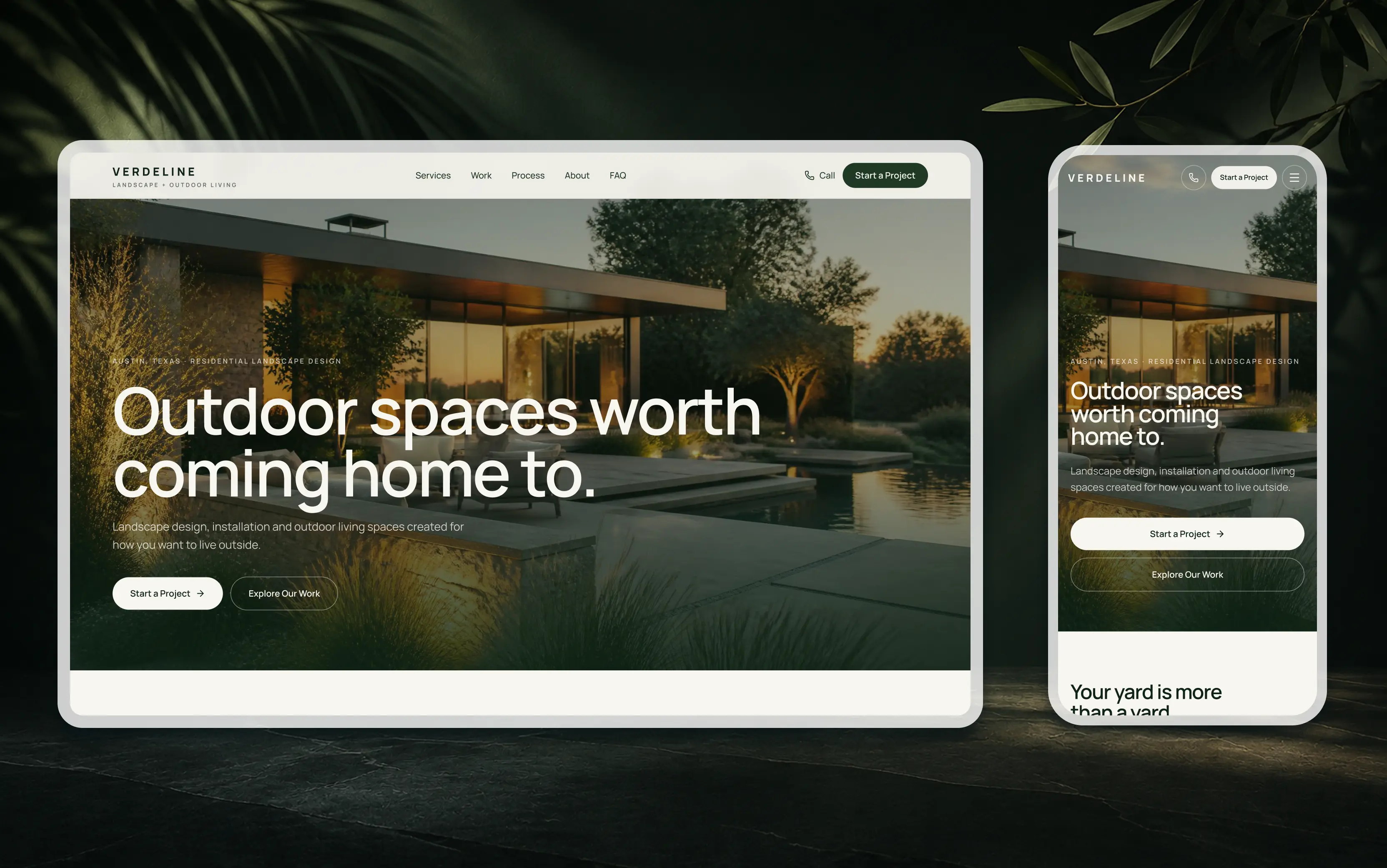
What a clear first screen looks like
Outcome headline, one line of proof, a single primary button and a quiet secondary link. Everything else can wait for the scroll.
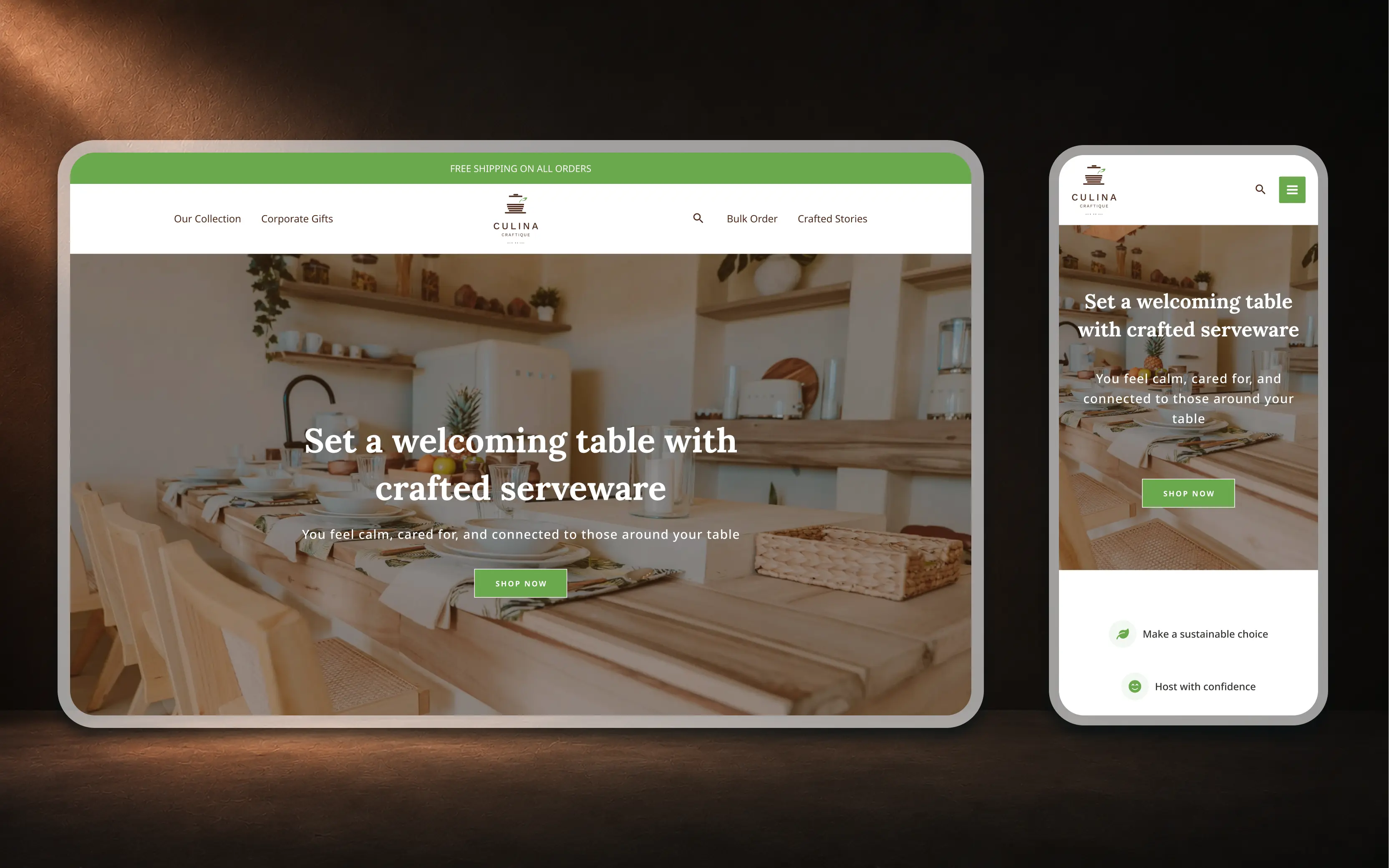
The 5-minute conversion audit
Open your homepage on a phone and tick these off honestly.
- I can tell who this is for within 3 secondsIf not, rewrite the headline.
- There is a real number or client name on the first screen
- There is one primary button, and it says what happens next
- I can find pricing guidance or a 'starting from' figure
- The page loads in under 2 seconds on mobile data
Questions
Is your website charming visitors but not converting them?
Send us your link. We'll reply within 24 hours with the three biggest leaks we see.
Start a project